Dare to Be Different
With regulators looking for more differentiation between tablets, we must be bolder with solid dosage designs. There’s a whole world of color and shape out there – let’s give our vanilla world a makeover.

“You’re a tablet design specialist – what does that entail?” people often ask me, assuming that the job of designing tablets is rather simple. But so many different shape, size and color options are available. The design process starts with a whole host of questions – the biggest: what is suitable for the target patients? Tiny tablets might be perceived as the easiest to swallow but they are hard to handle and easy to drop. And what about color? The one you’ve chosen for your tablet may not be suitable for the Japanese market (although it’s perfect for North America). And the manufacturing department may like that simple tablet design, but is it too easy to copy? Things are already getting complicated…
Unique designs are important. They can help to make medicines memorable to patients, caregivers and pharmacists, and may also make a tablet easier to take. From an anti-counterfeiting point of view, unique design could also make products more difficult to copy. There are also production benefits; a unique design gives you differentiation on the packaging line, making it easier to visually spot a mix up and prevent product recalls before they ever happen.
The advantages of better design have been acknowledged by the FDA, which issued draft guidance in 2013 – Safety Considerations for Product Design to Minimize Medication Errors (1) and New Guidance for Industry: Size, Shape, and Other Physical Attributes of Generic Tablets and Capsules, in 2014 (2). In essence, too many products and dosages look the same and there’s a risk that dispensers may distribute the wrong product, or that people taking more than one medicine (increasingly common in our aging population) will get their pills mixed up. Regulators now expect companies to consider aspects such as size, shape, color and differentiation between dosage strengths prior to marketing. It’s a brilliant initiative that’s made the industry wake up to the importance of tablet design. Similar-looking dosages, especially plain white tablets, may not get through the regulatory process. Your tablet needs to be different.
So where do you start? When I’m creating a new design, there are several key questions that I ask clients to help me deliver the most appropriate design. How big is the tablet? Who will be taking it – everybody, the elderly, only females or males? What is the therapeutic area? I also encourage the client to involve all stakeholders in the design discussions. A common mistake is to assume that you only need the R&D department involved in tablet design meetings, since they are the ones developing and formulating the drug, but if you include regulatory, manufacturing and marketing you can avoid a lot of problems down the line – everyone needs to know that there are limits! Regulatory will understand why they can’t have a bright yellow tablet, and manufacturing can voice their concerns on tablet shape, and offer guidance on what will and won’t fit with production lines.
I also conduct research on other medicines and co-medications in the same therapeutic area, so that I can identify opportunities for differentiation. Broadly speaking, the main design elements to consider are size, shape and color.
Tiny troubles
When is a small tablet preferable to a larger tablet or vice versa? The ideal size of a tablet varies depending on the intended patient group, but the actual size is often set depending on the formulation and dosage. If your dosage is 1300 mg then a tiny tablet is impossible, and this is where shape is extremely important. By altering the shape it’s possible to give the perception of a smaller, more streamlined tablet. If you have a very big tablet, it could also be worth considering more drastic changes; I’ve spoken with consumers before who say they would rather take two smaller tablets than one large one.
Is smaller always better? A study looking at pediatric populations found that tiny 5 mm tablets were not as attractive to children as expected, with interviewees being concerned about losing the tablet and some worried about swallowing it (3). The slightly larger 10 mm tablets were preferred.
Older patients also tend to prefer larger tablets because they are easier to handle (4). Again, you can use shape to change a patient’s interaction with the tablet. For example, by changing the dimensions you can lift it slightly higher off the surface, which makes it easier to pick up. Ideally, you need a good balance between ease of swallowing and ease of handling. Figure 1 shows how different shapes can affect the perception of size.

Figure 1. Tablet shape can affect the perceived size, and improve distinction and memorability.
The shape of things to come
For some companies, exploring different shapes can be daunting because it can affect the dissolution profile. Most companies do their R&D work on a standard round or oval tablet and it’s not until around Phase III that they start to think about the final product appearance. Obviously, the earlier you think about your tablet design the better, but it’s certainly not too late at this point to change the shape. In an interesting study from 2009, we demonstrated the importance of surface area-to-volume ratio on drug release from hypromellose matrices (5). I can use software to manipulate the mass properties of a tablet and change the shape without altering the dissolution profile. The software also allows me to preview other design options such as color and logo placement, which really helps speed up the process.
When I’m working with clients, I look at their needs and their product before presenting them with different shape and color options. Often, companies include these in their regulatory submission to show that they have considered the design of their tablets. It’s not just a case of picking a shape at random. Once again, the shape must match the needs of patients. For example, a heart-shaped tablet may be appropriate for heart medication, but it depends on the tablet size. A heart-shaped tablet of 700 mg, for example, may be perceived to be too big to swallow. Any bigger than this and more elongated shapes are more popular.
Suitable shapes will also vary depending on how robust the core formulation is. Due to the nature of their ingredients, nutritional supplements tend to be less robust, which means that some shape options aren’t possible. Companies’ manufacturing lines and tablet tooling also vary, which may limit options. You need to consider the final choice carefully.
Expand your palette
I’ve spoken to people who say that they don’t care what color their medication is so long as it’s effective. After all, color is a sensation that only exists in the brain and will not physically affect ease of swallowing in the same way as tablet size and finish. However, studies have shown that people do in fact prefer certain colors of pills, however unconsciously. We need people to take their medicines, so helping to encourage compliance is worthwhile. Color has other benefits too; I talked briefly about memorable shapes above but, when it comes to making a memorable tablet, color is without doubt the most important aspect. Color also improves brand recognition – just think of Viagra with its iconic blue color (and memorable diamond shape).

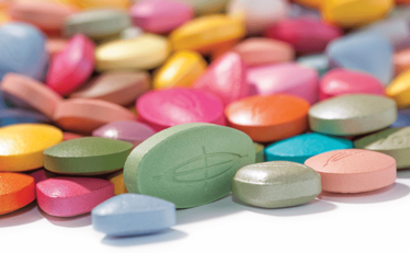
Figure 2. Just some of the many colors available.
How we feel about the tablets we are taking can also be influenced by color. In 2005, Colorcon conducted a study where 2,000 patients were asked to align different emotional attributes with different colors and shades (6). White aligns with ‘safe’, which isn’t surprising given that historically many tablets are white. But yellow and pink are also good choices and will aid product differentiation. However, attitudes towards color are market-dependent. For example, red can be seen as powerful or dangerous depending on the country. Results will also vary with gender and age demographics. As well as taking into account emotions, you can also use color to indicate what time of day a tablet should be taken. Some people associate dark tablets with being taken at night and lighter tablets being taken in the day. A good example of this is day/night cold remedies, where yellow for day and blue for night are used. At the moment, people are not used to seeing bold-colored tablets, but I think this will change as companies make more effort to differentiate products. Figure 2 shows just a few of the many colors and shades that are available.
When thinking about color, your choice will be strongly influenced by ingredients and what the regulators in various parts of the world have to say. Some countries have restrictions on different pigments, so you may have to consider country-by-country formulations. At Colorcon, our regulatory department helps ensure the choice of suitable pigments and we use a color decision tool to show what customers can use around the world and breakdown by region: Europe, North America and Japan. For Japan, the color options are typically much more limited because of regulations on dyes; for example, you can’t use brightly colored aluminum lake pigments in Japan. Iron oxide-based colors are truly global and offer many shades, but are from a more reserved palette of beiges, yellows, browns, and grays.
As well as color, you can also add markings, or even images, to your tablet using edible inks, which really helps to set products apart. If counterfeiting is a big concern, there are technologies now available that can “fingerprint” the product through incorporation in the tablet coating.
The final finish
I’ve discussed some of the basic elements of tablet design and hopefully inspired you to think more creatively about your tablets. But size, shape and color are not the whole story. Whether a tablet is matte or glossy also influences patients’ thoughts. Which would you prefer to take? A high-gloss tablet is visually appealing and has been shown to be easier to swallow (7). Most companies choose to apply a film coating to get that glossy effect. A film coating can also be used to mask unpleasant tastes and odors, improve mechanical integrity and protect the tablet from moisture. Covert chemical markers can also be incorporated into a film coating to help prevent counterfeiting, as well as specialized flavors and aromas that are identifiable by patients.
With so many options available, there’s a trend away from producing a plain white tablet. We’re already starting to see companies being bolder with their designs and I believe patients will find these alternative colors and unique shapes appealing and memorable. The great news for pharma companies is that being different needn’t result in manufacturing challenges or increased costs. So don’t be afraid to stand out. You can make life easier for patients – and much harder for counterfeiters. Dare to be different and reap the rewards.
Five Top Tips for Tablet Design
- Carefully consider the design of your tablet and how to differentiate multiple dosage strengths. Regulators may reject a submission where tablets are not well differentiated.
- Make it easier to swallow by paying close attention to physical attributes such as shape, size and coating.
- How a tablet looks can affect how patients feel about their medicine and influence compliance. Choosing the right color may prevent medication errors.
- Consider the right tablet shape, size and colour for your patient population to improve patient adherence.
- The more unique and complex the tablet design, the more difficult it is for counterfeiters to make convincing copies.
- FDA, “Safety Considerations for Product Design to Minimize Medication Errors” (2013), www.fda.gov.
- FDA, “New Guidance for Industry: Size, Shape, and Other Physical Attributes of Generic Tablets and Capsules” (2014), www.fda.gov.
- H. Batchelor et al., “Tablet Size Acceptability in Pediatric Populations: Preliminary Data”, presented at EuPFI Conference, Barcelona (18-19 September 2013).
- M. D. Ali et al., “Oral Solid Dosage Form Characteristic Preferences Amongst Older Patients”, presented at UK PharmSci, Nottingham (8-10 September 2014).
- P. Patel et al., “Investigation of Effect of Variable Surface Area-To-Volume Ratios & Film Coating on Drug Release From Hypromellose Matrices”, poster presented at AAPS, Los Angeles (8-12 November 2009).
- L. Harrington et al., “Colorcon Global Color Preference Survey” (December 2005).
- C. Wilson et al., “Opadry II / Opadry / Opaglos 2”, poster presented at AAPS, Salt Lake City (23- 26 October 2003).
Charlotte started her pharmaceutical career in Quality Assurance with GSK and GW Pharmaceuticals.
Since joining Colorcon in 2008, she has completed a BSc in Biosciences, gaining experience in regulatory affairs and quality assurance, as well as technical expertise in solid oral dose design. Charlotte’s primary responsibility is management of Colorcon’s Brand Enhancement Service for Tablets within the EMEA region. This involves providing tablet designs for pharmaceutical products through combining knowledge on therapeutic categories, patient preferences based on the customers own development brief. She combine technical knowledge and experience with her creative flare.


